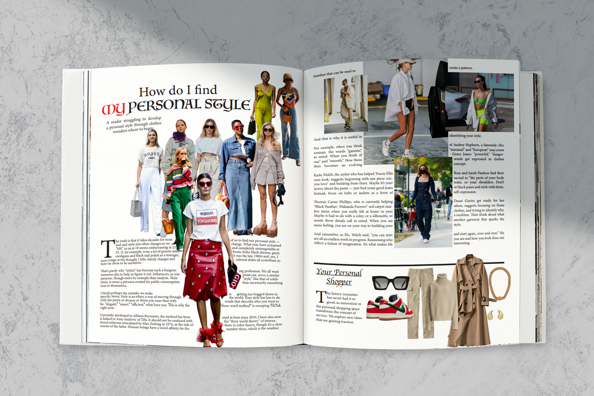
For my first spread, I decided to use various images of street styles I found on the internet. I downloaded the images and uploaded them to Adobe Express, where I deleted their
backgrounds. I then placed them on Indesign and placed them as I liked them. I wanted for them to be in the middle of the first page, with one of them standing out. I sized them
accordingly and positioned them as well. I then wrapped the text around the images and
reduced the font size to 10 pt. Then, I changed the fonts on the Title to make it more interesting. I also change the color of the word “My” to make it standout.
On the next page, I tried to keep it a little bit more simple so I added full images of outfits I found online. In this page I also used wrapped text to make my text go around the images as many magazines do. I then added a line to separate a section on the bottom of the page where I added images of items of clothing and accessories. I also deleted the backgrounds of these images on Express before placing them in my page. I did this because I saw that many fashion magazines tend to create outfits as inspiration for their readers.
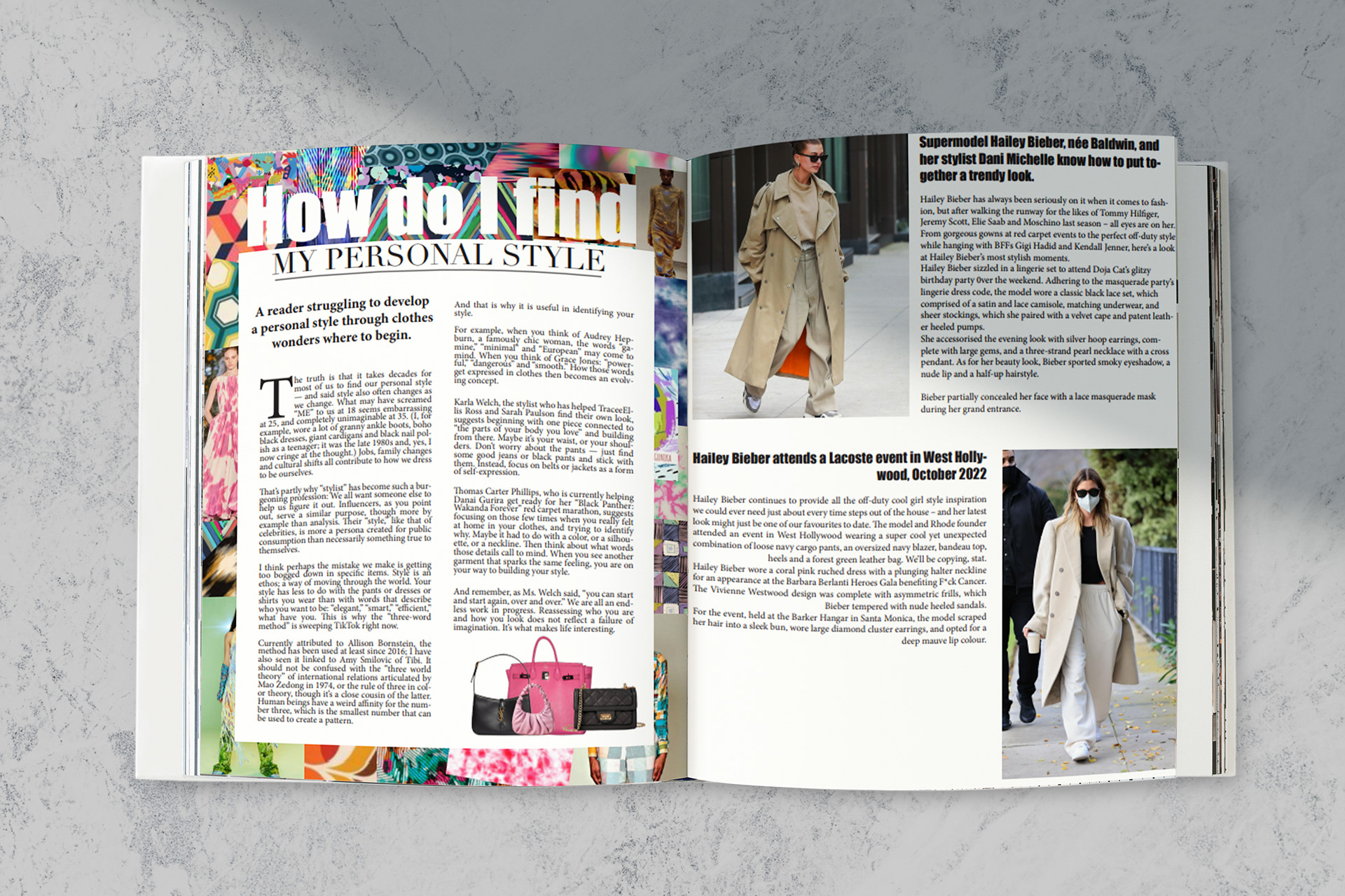
On the second spread, I wanted to be more creative and artistic so I decided to make a collage of images of trending patterns in fashion as well as some images of models wearing designer brands. I made this collage the background of my first page. I then added a white rectangle, where I placed my text. I wanted part of the title to stand out so I decided to make it out of the rectangle where most of the text is. To create contrast between the title and the collage in the background, I changed the fonts to a thicker font and made it white so that it would stand out. I also found images of purses online, deleted their backgrounds on Express, and placed them at the bottom of the rectangle.
For the second page, as the first one was already really colorful and cluttered, I added two pictures of outfits I liked and two subtitles for each of the images as well as text.
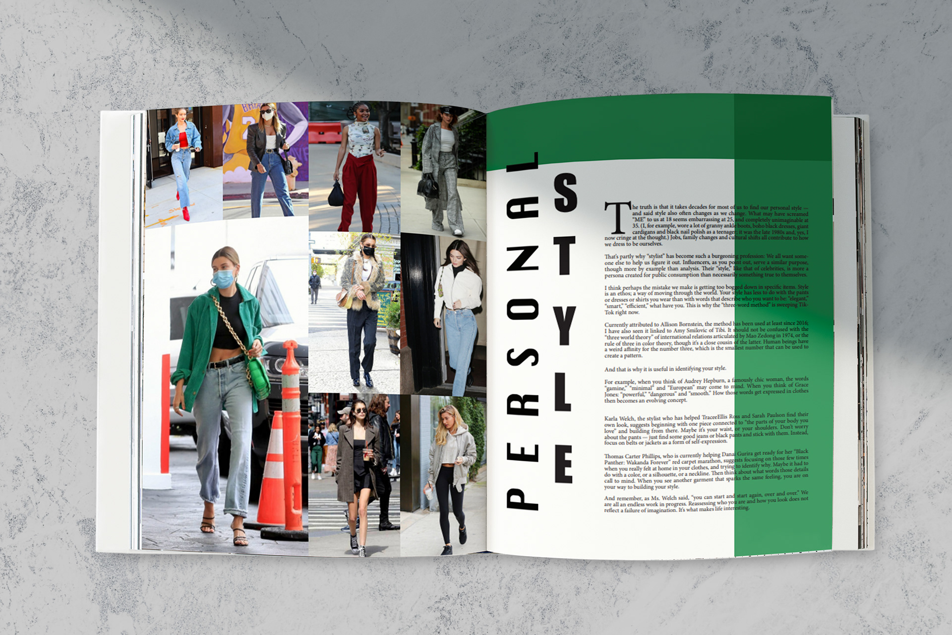
On the third and last spread, I decided to keep the first page simple and make a simple collage of different outfits seen on celebrities. On the second page, I decided I wanted to make the title more interesting so I made it vertical and with different fonts. I then added the text and decreased the size to 10 pt again. Because the page was still very white, I felt something was missing. I decided to add two asymmetric borders to only two sides of the page. I decreased the opaqueness which made the corners of both rectangles overlap and create a darker shadow. I then tried out different colors and found that green was the one that looked best next to the collage because the main picture in the collage portrays Hailey Bieber wearing a green outfit.