
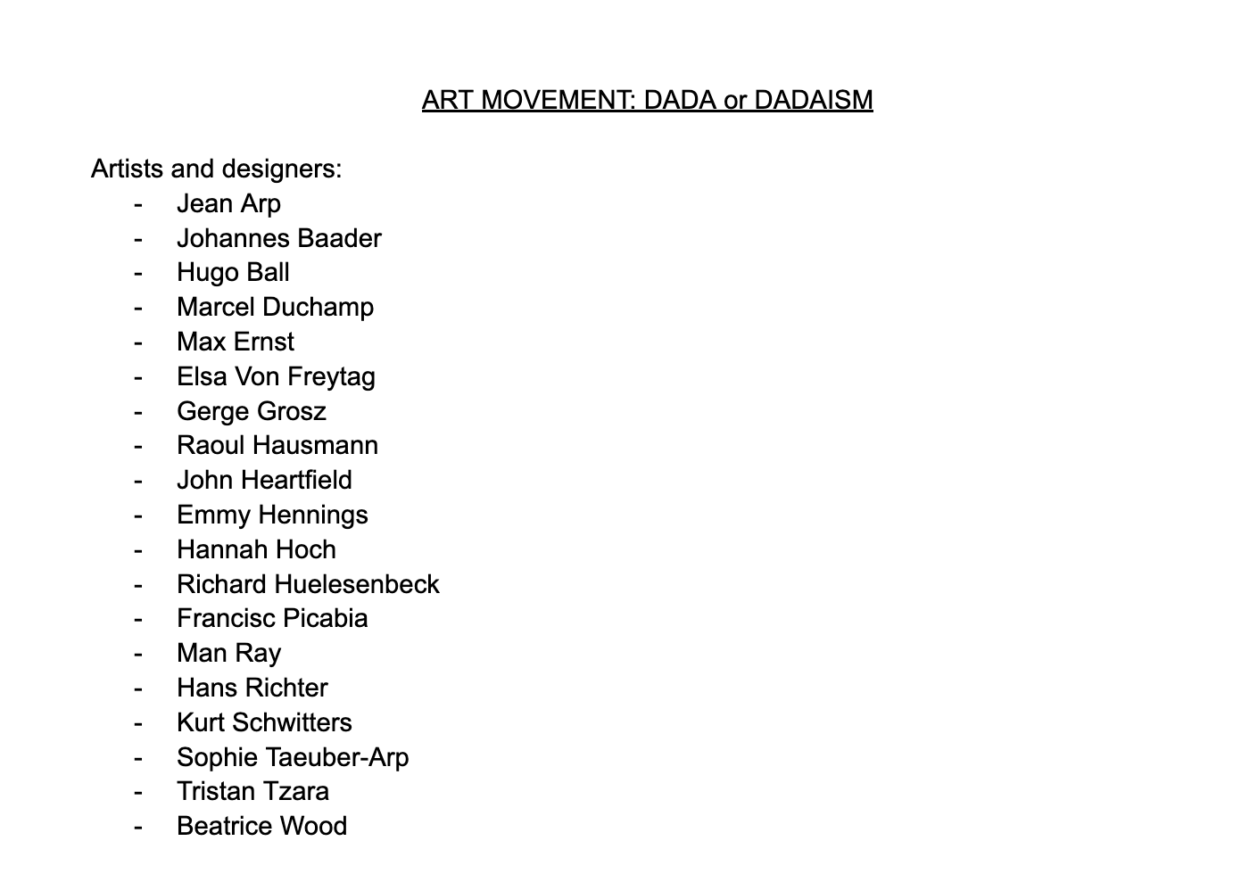
DADAISM - Climate Change - Typography Poster
PROJECT, DESCRIPTION AND PROCESS

For this Advertising assignment we were asked to choose a cause from a list given by the professor and create a poster revolving around Typography in order to further explore how the typography part of advertising works. We were also asked to inspire our design and fonts on a specific art movement. In my case, I chose Climate Change as my cause and was given Dadaism movement as my art movement.
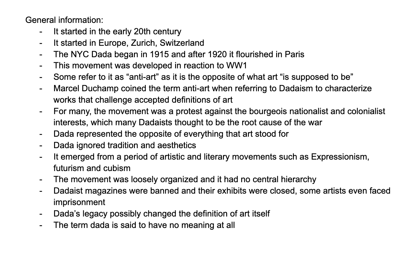
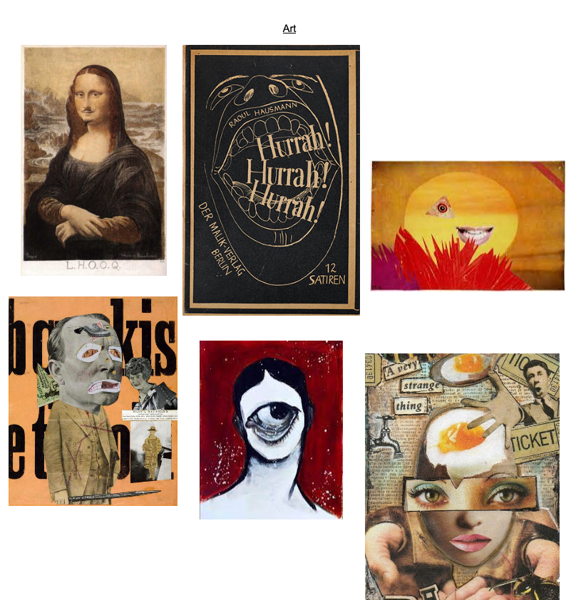
Previous to this assignment, I had already learned about the Dadaism movement as I have taken various art and art history courses. However, taking the movement and creating a project inspired on it which also had to be linked to Climate Change, was definitely challenging for me. I decided to dig deeper and try to really understand the art movement to be able to really portray it in my design. I first looked up all the history related to the art movement to give me some context. After understanding the history, I proceeded to look for original art pieces from the movement to see what artists considered Dadaism. After that, I looked for modern posters made my people in recent years to try to get an idea of how Dadaism has been modernized and try to incorporate that in my design as well. When looking at the art and posters, I took in the fonts, colors, and order they used so that I could try to do something similar in my design. After researching the art movement, I researched a bit about Climate Change. I then started working on my design. I first drew a couple designs in my sketchbook and decided which one I wanted to go with.
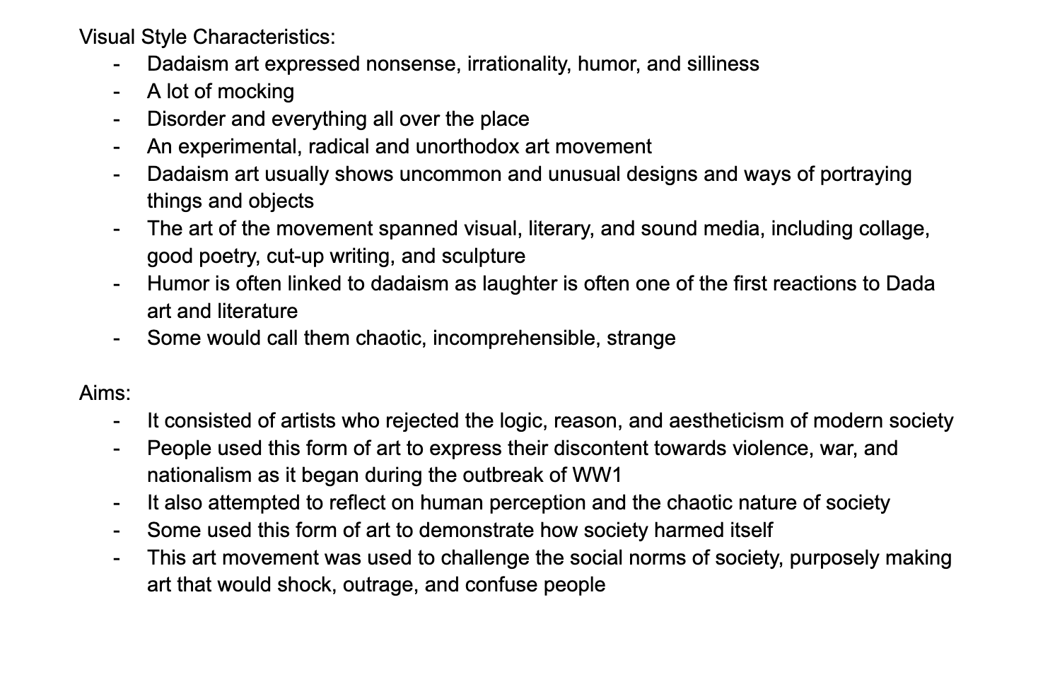
I tried choosing one in which the fonts stood out as that was the focus of this assignment. However, in the Dadaism movement, you see various objects, words, images stacked up and clattered which is why it was a bit hard to make the fonts of my design stand out. I tried balancing the background design with the actual typography the best I could in a way that would also be linked to the art movement I was given. I know we were supposed to use a limited color palette for this assignment, but I believe Dadaism is all about contrast, a mix of colors and fonts, and breaking the rules and expectations. I still tried to stick to as few colors as I could and thats why you can see mainly green, blue, yellow, red, and brown tones all over my design. I chose to use these specific colors because I believe they are usually linked with the environment and the whole idea of my project was to protest to save the world so I thought the colors would be perfect.


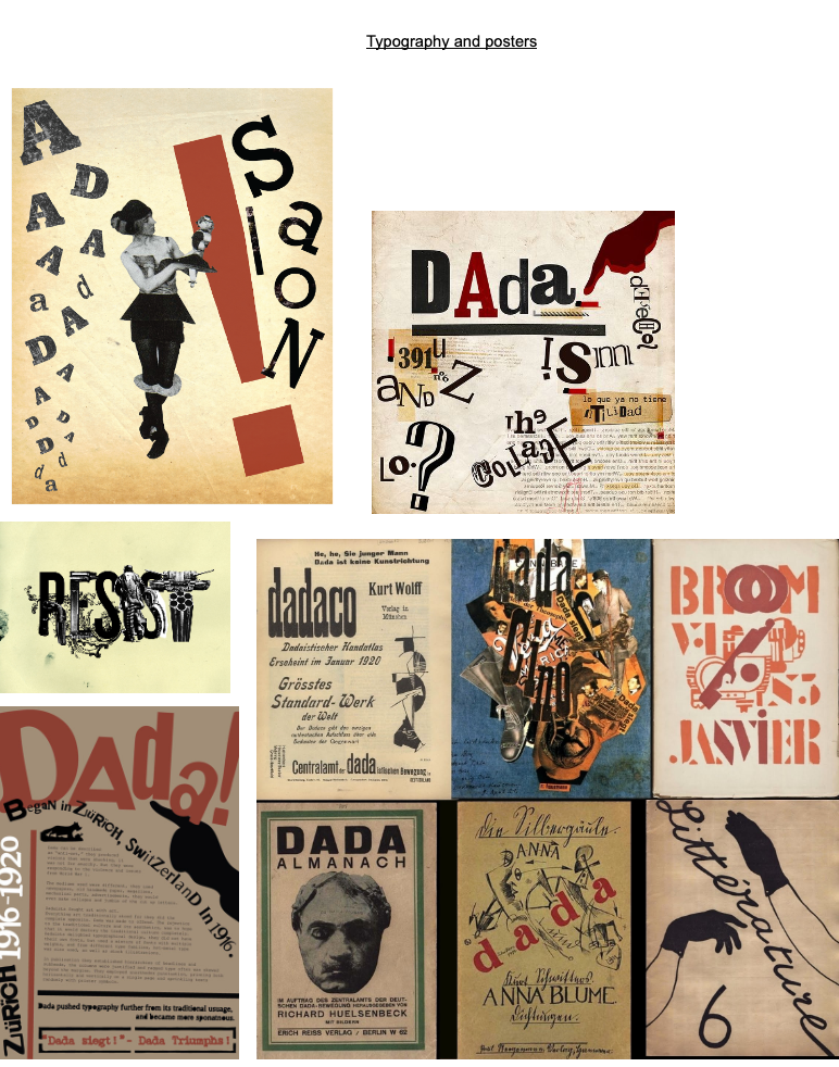
These were some of the posters I used for inspiration. I found them in Behance as well. I also used some images and fonts from them as you can see in my design.
Finally, in terms of the images I chose, I decided to go with weird, nonsense-like, silly illustrations to go with the art movement. Dadaism is all about experimenting, breaking or challenging the norms of society and purposely making art that shocks which is what I tried to do. People also used Dadaism art to attempt to demonstrate how the society and humanity harmed itself and its own home. They used it to express their discontent towards violence, war, nationalism, and anything that harmed humanity, the environment, or society. I tried to portray this in my design by using illustrations and images that show the damage the environment is enduring and try to not only create shock but confusion by the illustrations as well. I believe the images and illustrations I used are not very common in posters which is why I chose them.
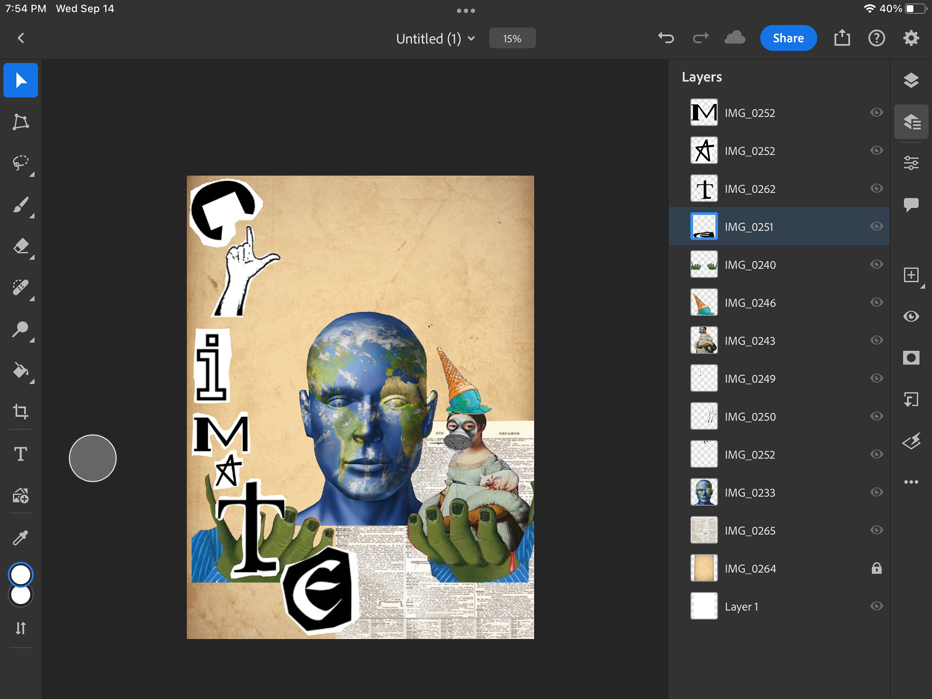
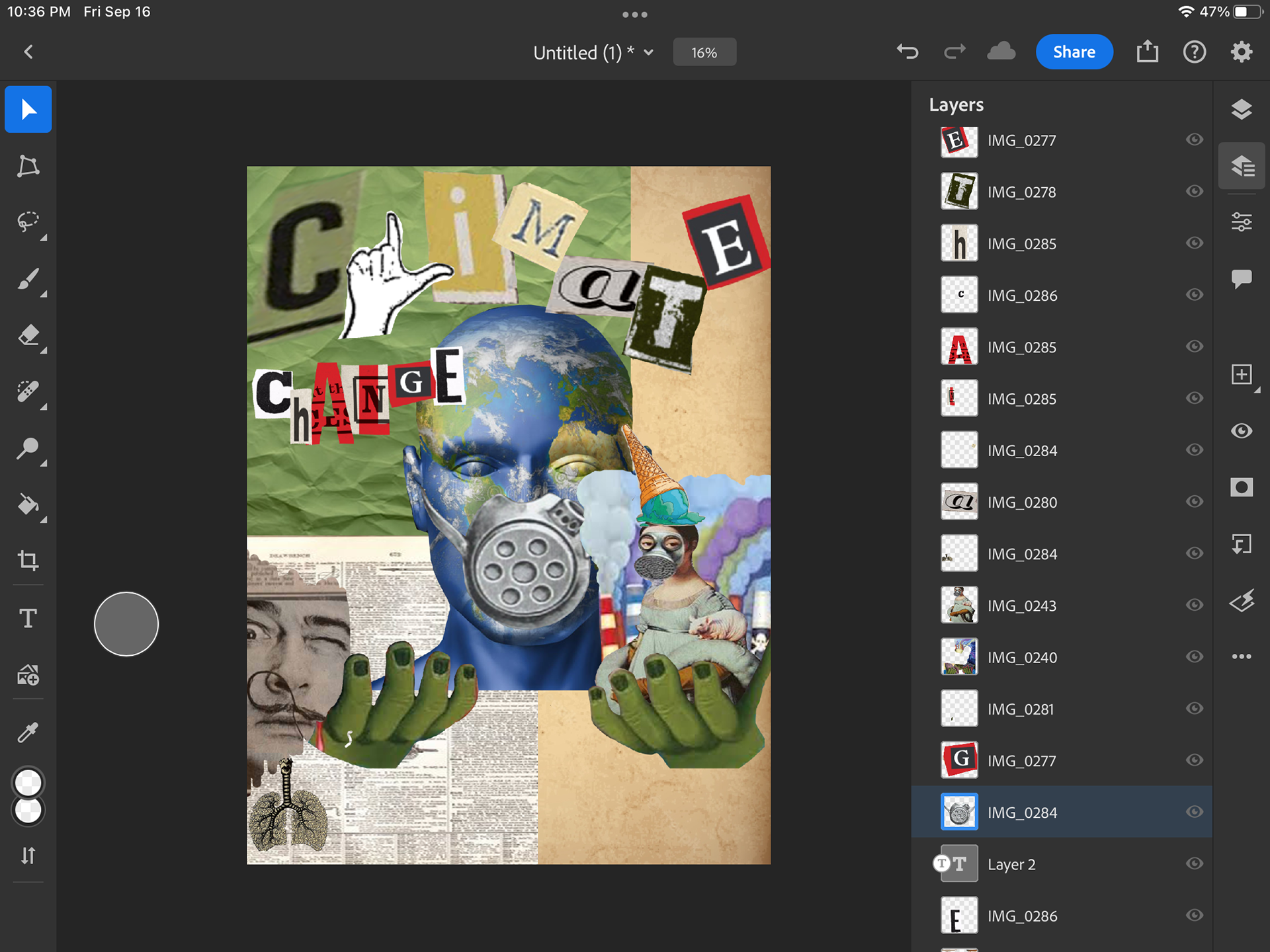

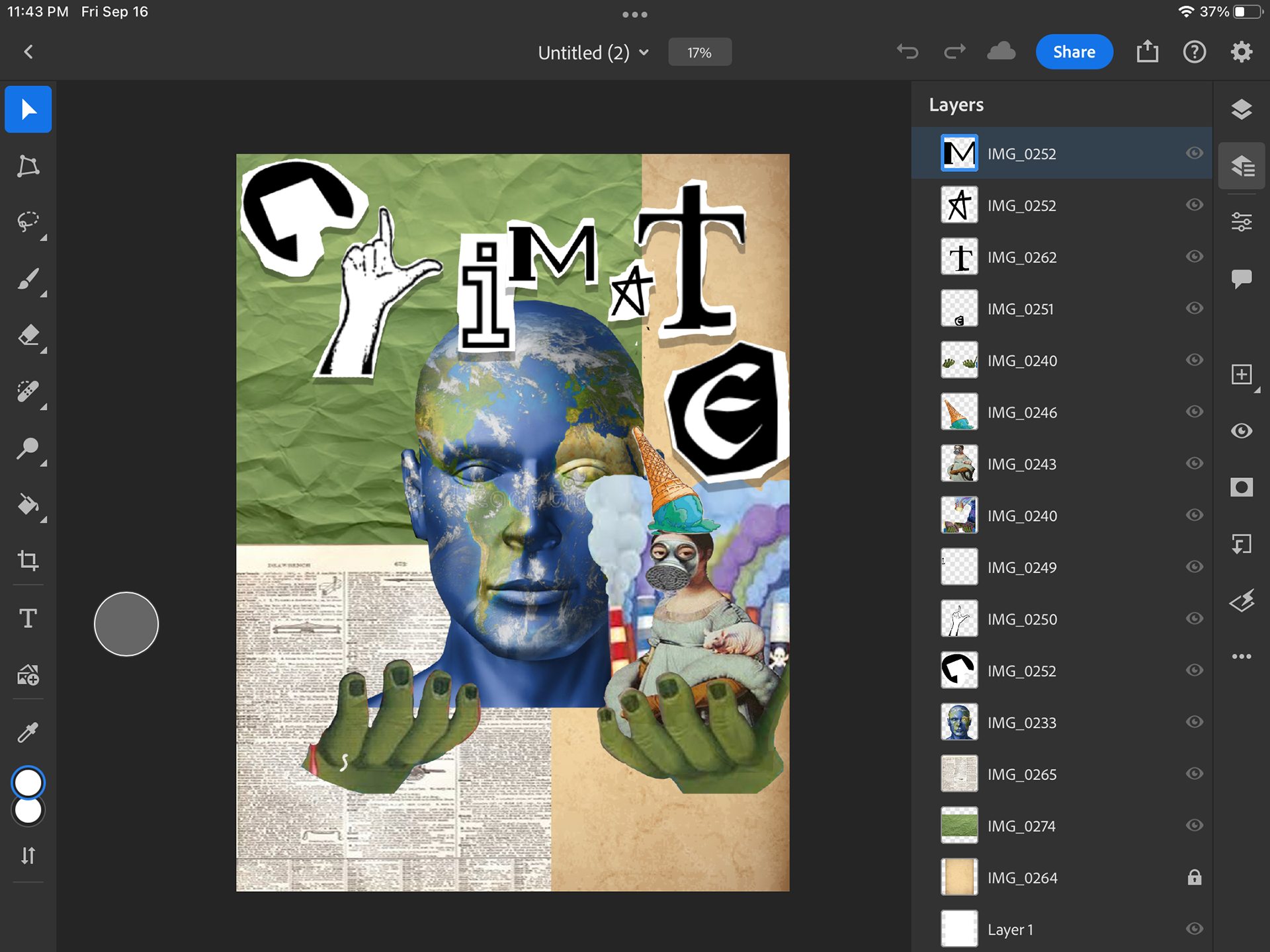
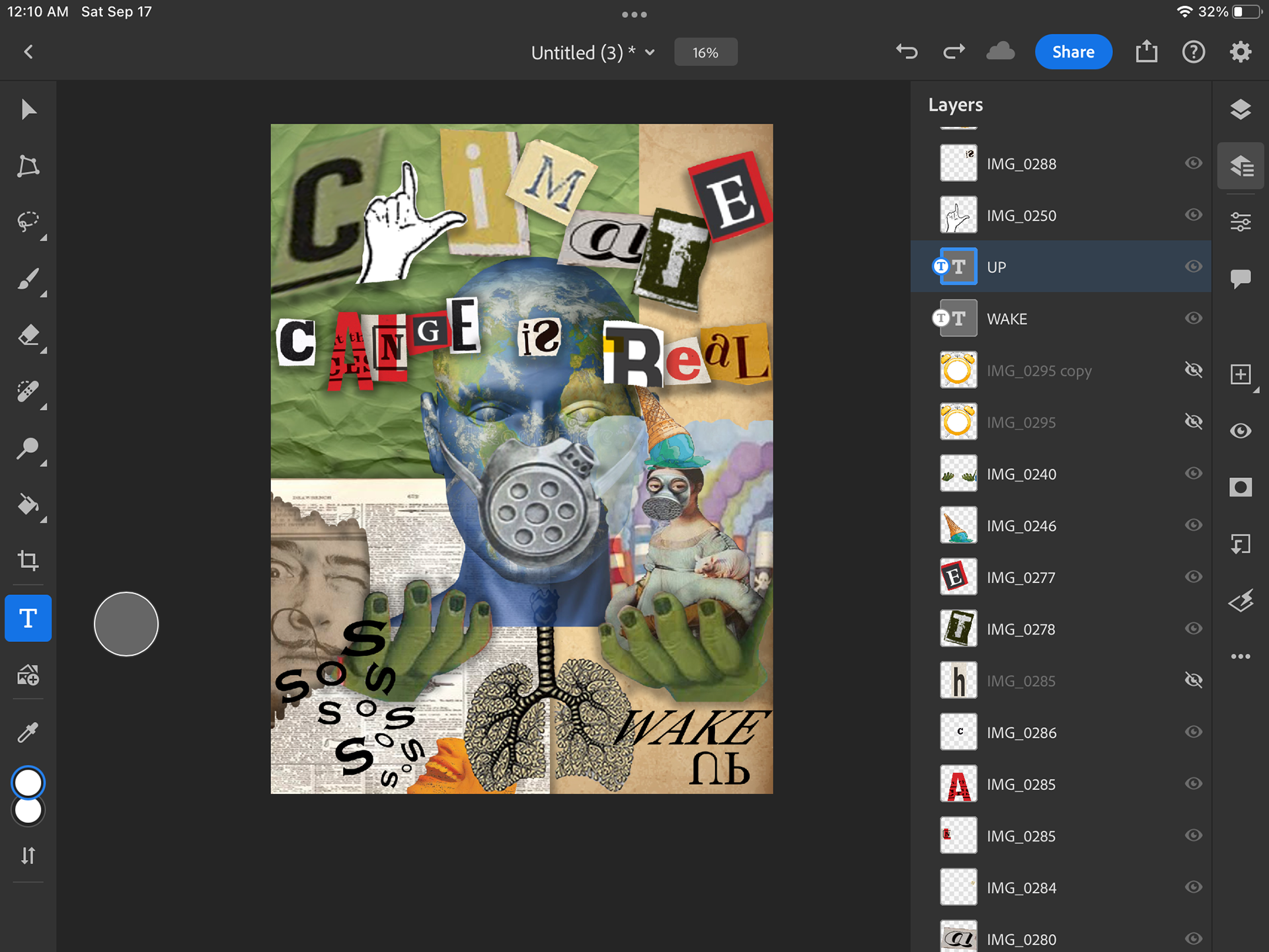
I took these screenshots at different times while doing my design just to keep track of the different things I tried out
RESEARCH AND SOURCES

Sources
- https://en.wikipedia.org/wiki/Dada
- https://magazine.artland.com/what-is-dadaism/#:~:text=Dadaism%20was%20a%20movement%20with,its%20own%20kind%20of%20nonsense.
- https://www.artyfactory.com/art_appreciation/art_movements/dadaism.htm
- https://www.artlex.com/art-movements/dada/