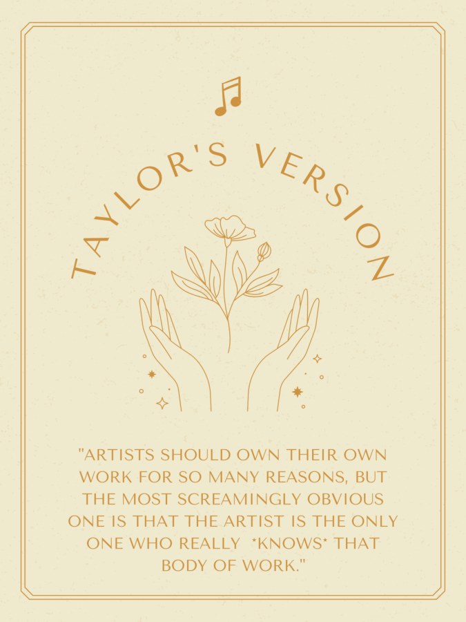
Taylor's Version Beer (Tennessee Crafter Beer)
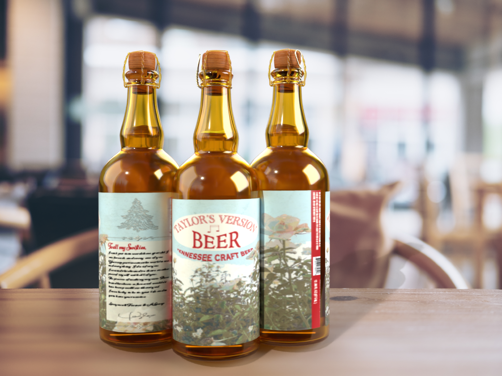
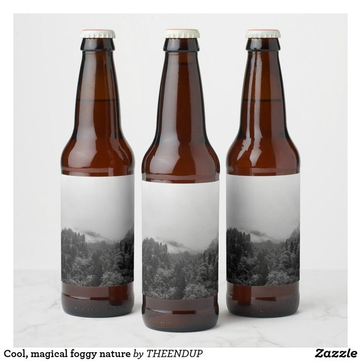
Final Beer Bottle Design
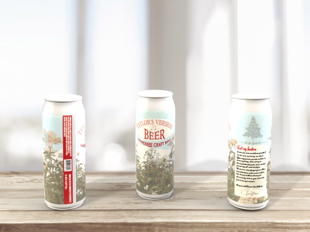
Final Beer Can Design
DESIGN PROCESS
This is my final packaging design. For this assignment, I was asked to create a packaging design for a new beer brand owned by Taylor Swift. I had to research her brand and style in order to create the appropriate design for the client. Using elements from her brand and music career, I proceeded to create a beer label that I believe she would like.
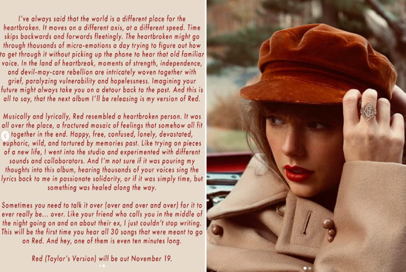
For this design, I really wanted to capture Taylor Swift's essence and make something that her fans would feel compelled to buy. While researching information about her, I found out that she likes to maintain a close relationship with her fans, reaching out to some of them, constantly posting appreciation messages for them, and sharing personal aspects of her private life with them as well. She is also known for dropping clues in her social media about her unreleased albums which drives her fans insane and always has them on the edge of their seat.
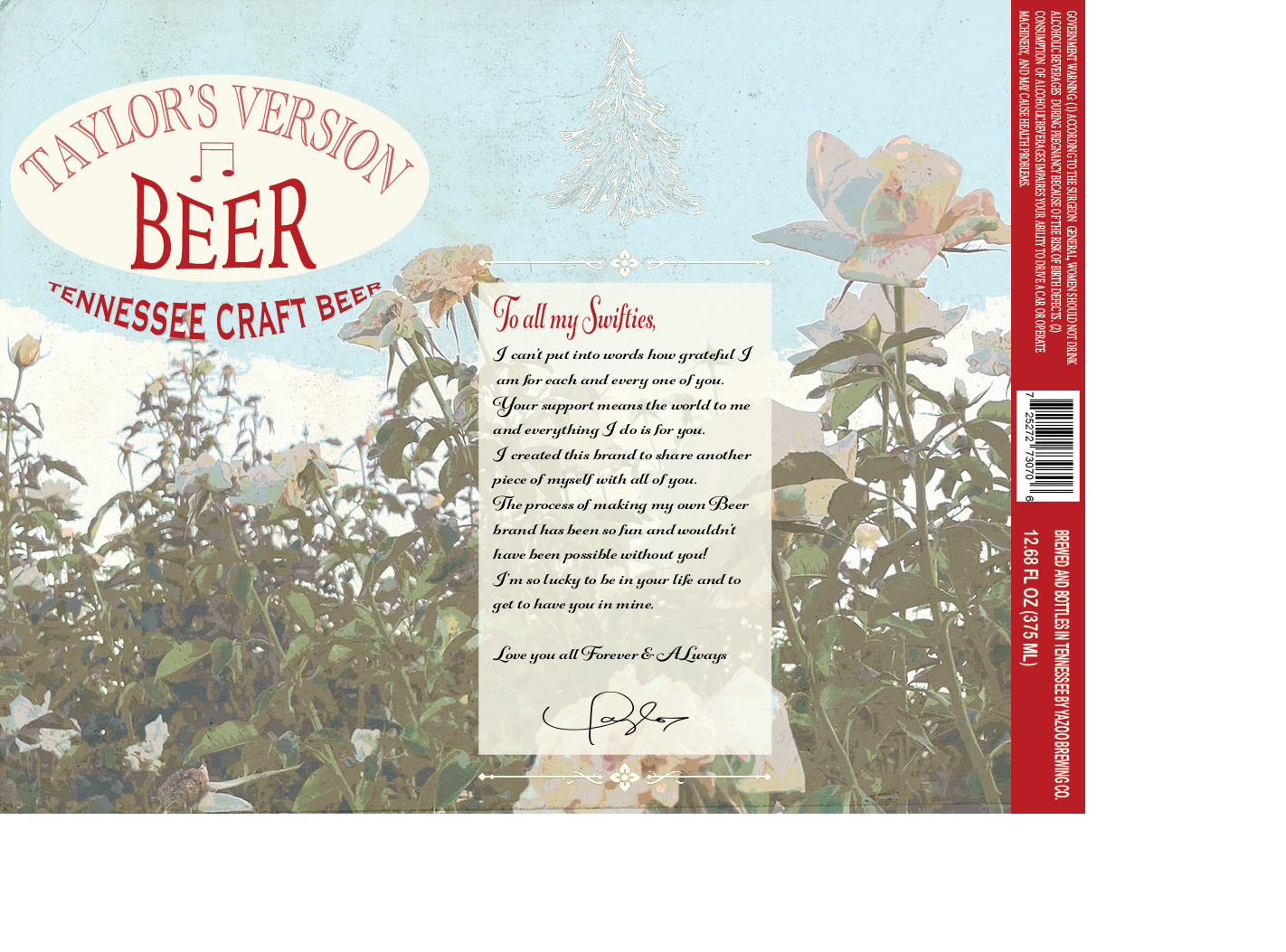
Final Label Design
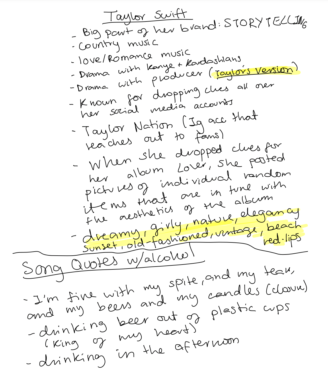
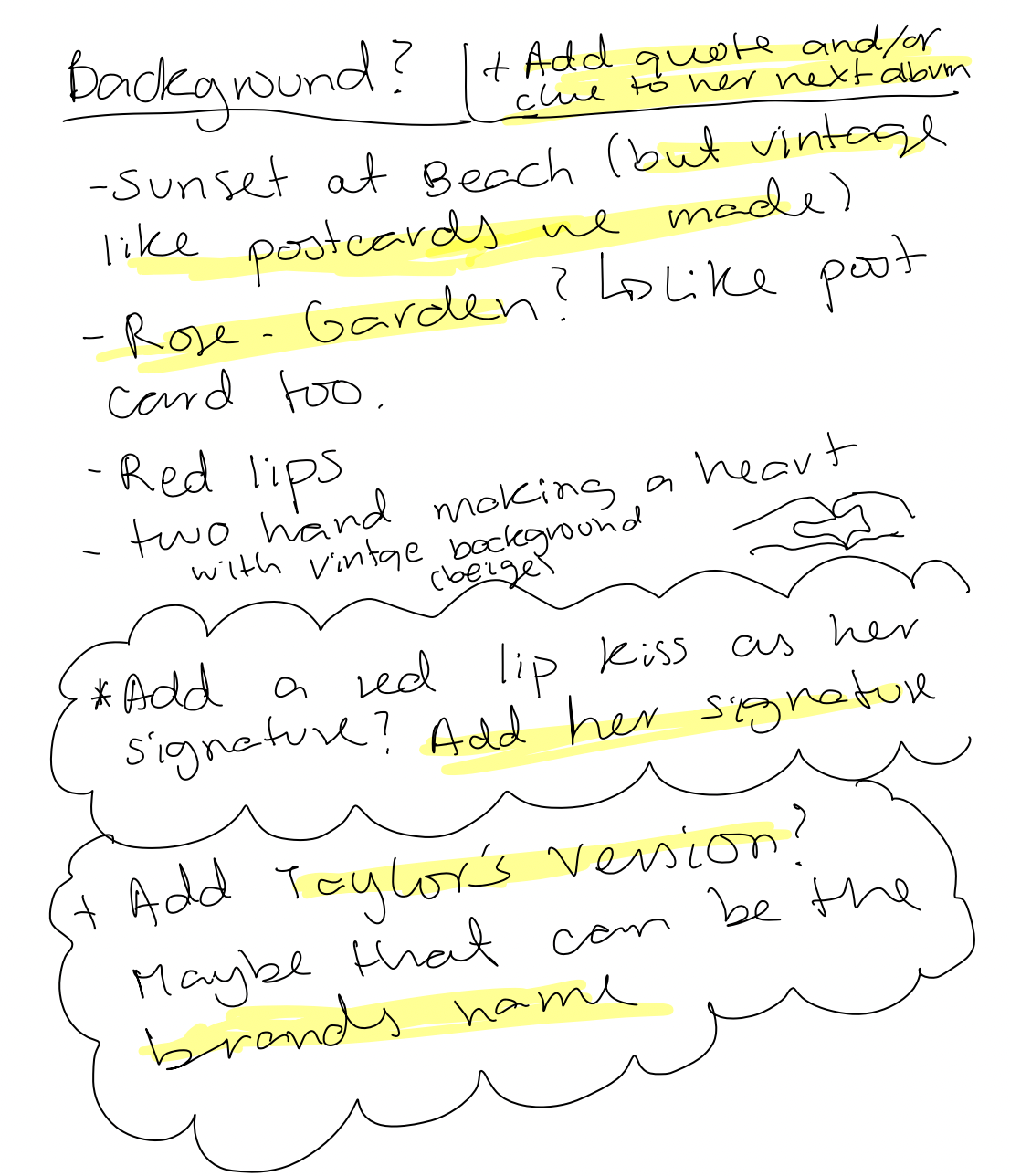
My notes and research
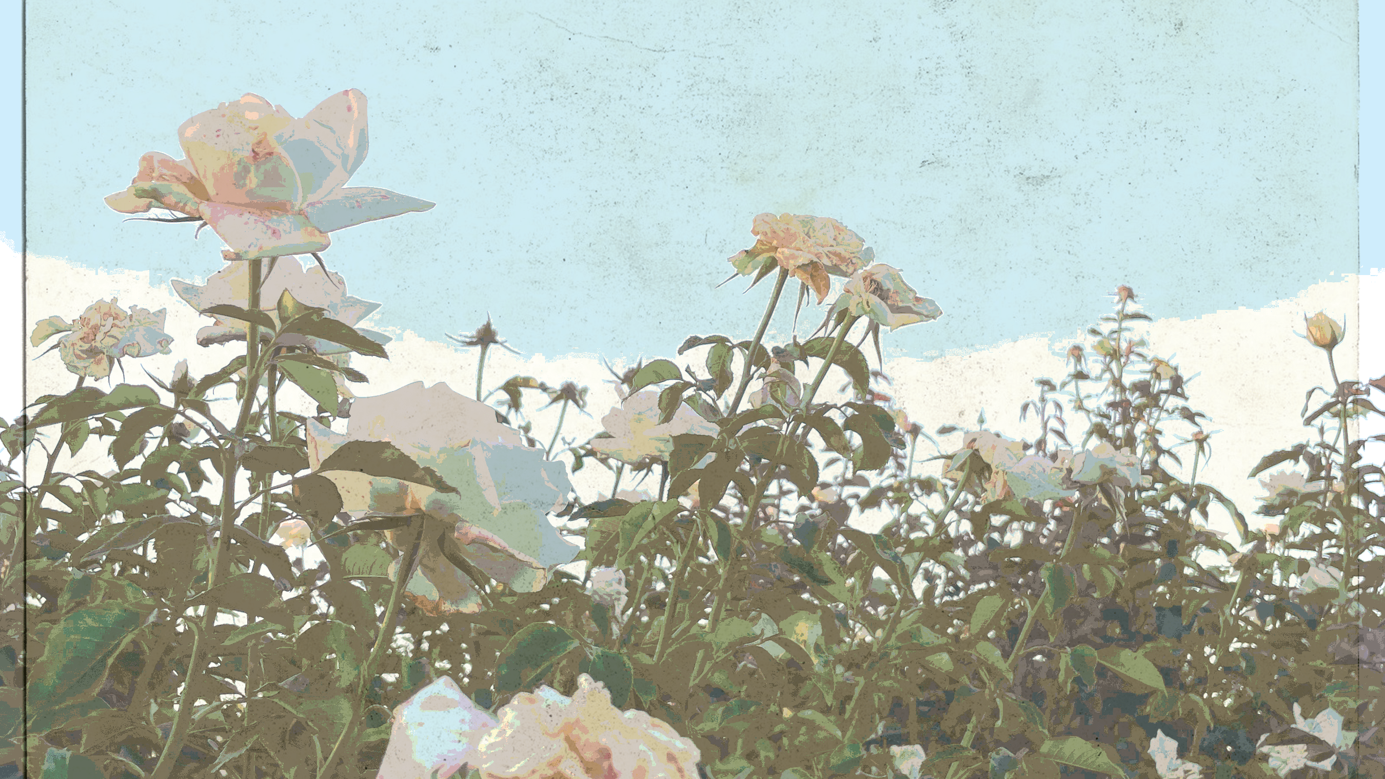
Taylor Swift has always given off the vibe of being an old soul, according to her fans. Some words I found that fans usually link to her were: real, old soul, vintage, amongst others. Due to her love for nature and her vintage/old-soul vibe, I decided to go with a vintage landscape picture for the background of the beer label.

For the name of the brand, I decided to go with "Taylor's Version" because it is a reference to Taylor's recent battle to get ownership of her own songs again. She did not own the rights to her previous albums, which caused a scandal in the media and ended in her re-recording all of her songs in order to claim the rights to them. The copyrights scandal that lead to this was very famous and trending in the media a couple years ago. When she came out with her Taylor's Version songs, it was a great breakthrough that meant she had won the battle. The sentimental history behind "Taylor's Version" is definitely what made me choose it for the name of my brand. As I mentioned before, she likes to be close to her fans and share personal information with them and I believe there isn't anything more personal to her than her songs, the ownership of them, and the battle she had to go through to win them back.
I then added a subtitle, "Tennessee Crafted Beer", which is a reference to her roots as she grew up in Tennessee and talks about it frequently in her interviews. It is also a reference to her country music era. I wanted to add something about her past to make the design more personal which is why I added this. The fonts on the name of the label and the subtitle are red because according to the internet, that is the color she is mostly linked to. Taylor has a song called Red, which is one of her most famous songs, and mentions the word red in many of her other lyrics. She also uses red lipstick a lot which makes it her staple in a way. I believe these are the main reasons why the color red is strongly linked to her and because of that I wanted to add some red to my design.
The design in general is very minimalistic and shows very few contrasts and bright colors. I decided to do this in order to portray her simplicity. Taylor Swift is known for being a really down-to-earth and real person, unlike many other celebrities.
I then added a personalized note from Taylor to the design as this further portrays her love for her fans and how she likes to be close with them. The first line of the note says "to all my swifties". Swifties is a term used to refer to the Taylor Swift fandom, and recently Taylor Swift has been granted the rights to use the term for her own brand. I believe including this term will be meaningful to all of Taylor's followers and fans because they are the ones who created it and for her to use it in her own brand will make them feel heard and noticed by her. On the last line of her note, I added the phrase "love you forever and always" as a reference to her song titles Forever & Always. Finally, I added her signature on the bottom of the note to make it more personal and meaningful. I tried to add as many references to her life and music career to this design.

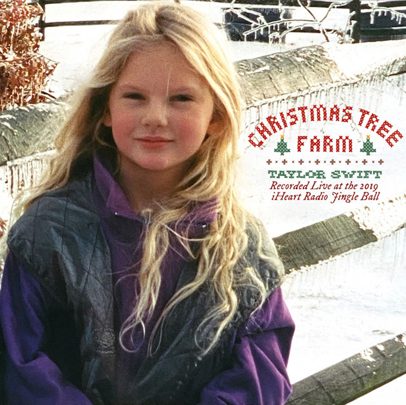
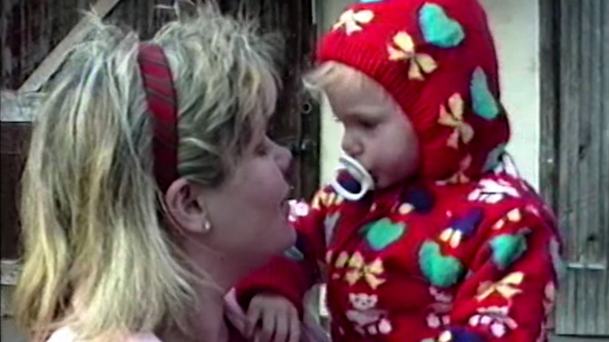
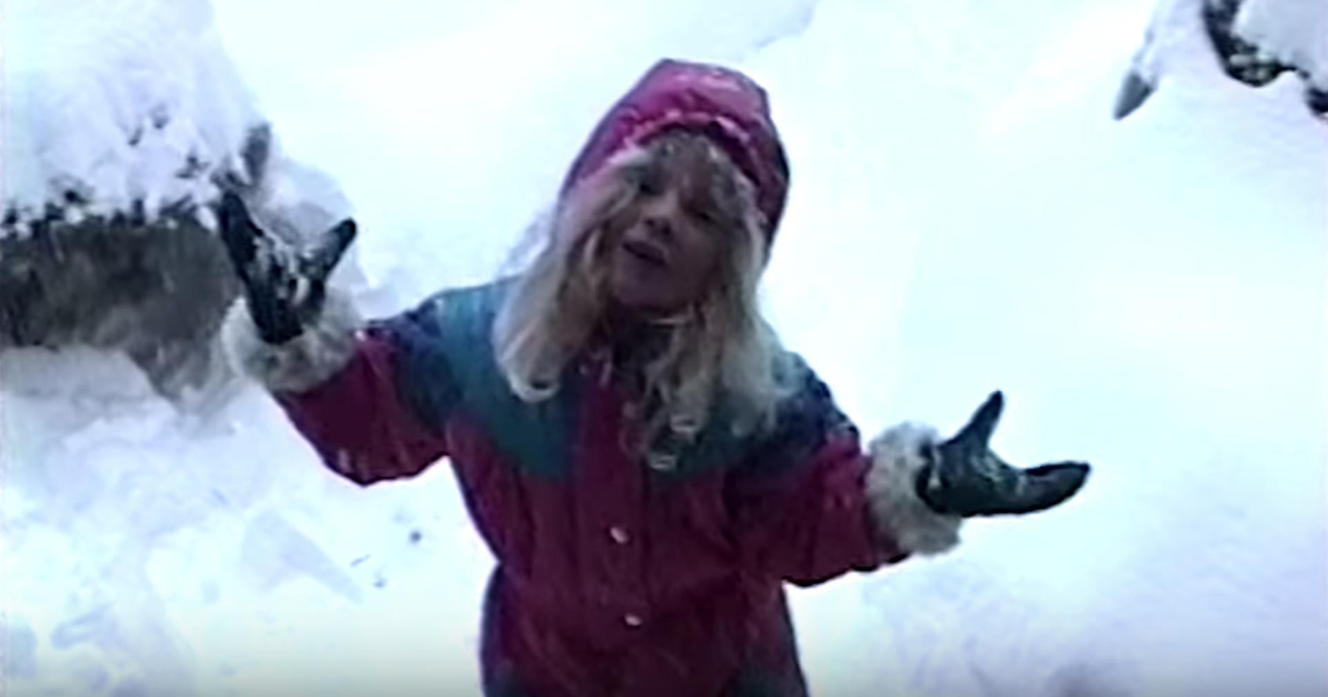
I added a symbol of a Christmas tree above the personalized as a small clue linked to her past. Taylor Swift was raised in a Christmas tree farm, where she had some of her best memories. This is not a fact that is very well-known, which is why I am using it as a clue to her past. Some people will understand the reference to the Christmas Tree farm from her past, and some other will learn about it with this design. Every element in this label design has a meaning and purpose. This one is to make a reference to her roots and past which she keeps very close to her heart. She even has a song titled Christmas Tree Farm, and the video clip is a compilation of short clips of her as a baby roaming around the farm.

When it comes to the bottle design, I chose to go with a thicker brown glass bottle because I believe this ads to the "vintage" look I'm trying to achieve. I tried to recreate an old beer bottle design for this. I also decided to go with a cork instead of a regular cap to add to this old-like design. I didn't add the nutrition label because that will go in the box containing the beers.
INSPIRATION IMAGES
Initial Design Sketch
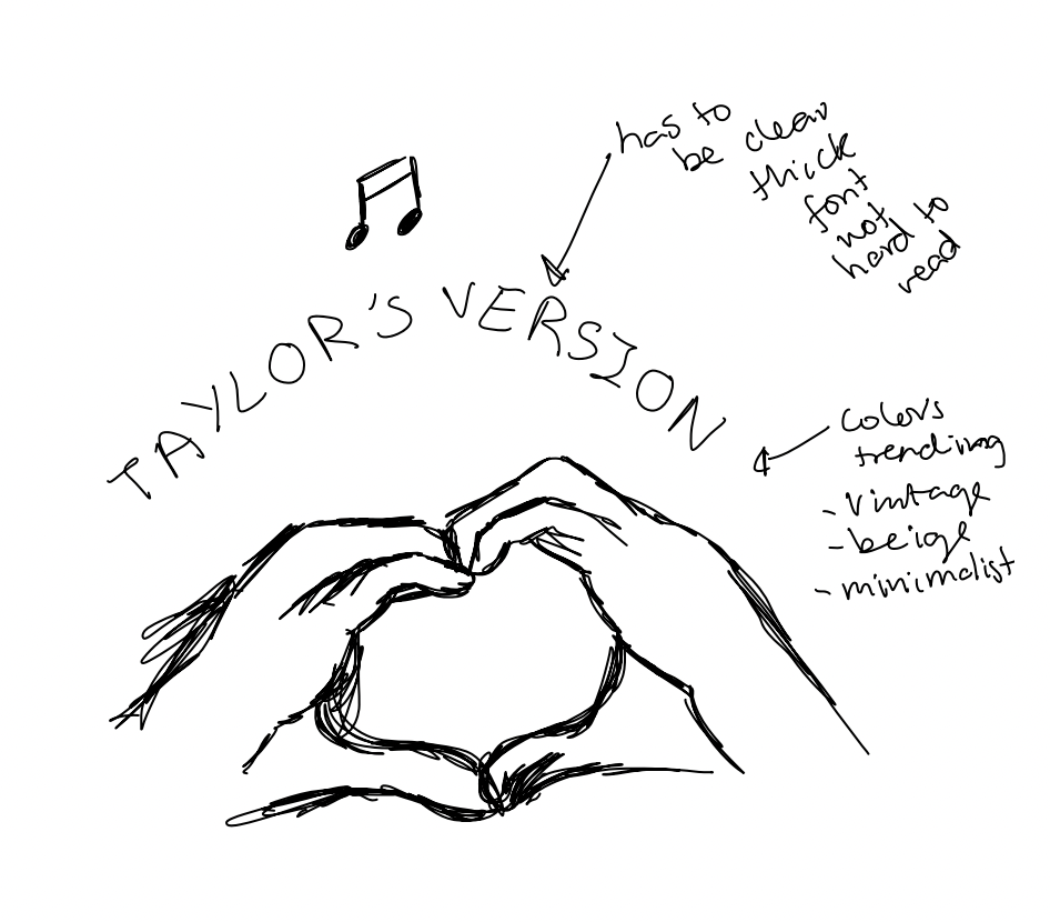
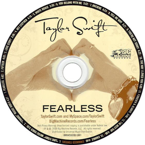
This was the first design I came up with. At first, I wanted to add two hands making a heart shape because that is the cover of one of her CD albums. However, when I tried it out, I didn't really love it so I decided to make the design plain and leave some space underneath the brand name so that the public could have a good view of the background as it also has a meaning and purpose.